3D Animated Grid Gallery CSS3D Animated Grid Gallery CSS
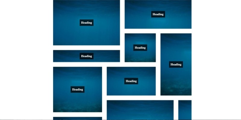
A stylish and neat three dimensional animated grid picture gallery.3D Animated Grid Gallery CSS
A stylish and neat three dimensional animated grid picture gallery.
Overview
Weather you want to display products, or simply demonstrate a gallery full of images, This 3 dimensional animated grid gallery will certainly grab your users attention!
Images get displayed in a very neat grid format and animate themselves in, one after another, when the page loads in a 3d spinning kind of way.
You can customise the grid items by putting a stylish heading on it which will describe what the item actually is and you can even change the item so that it links off to another page, perfect if you are displaying product or article teasers!
Features
* Configurable background for grid item
* Optional descriptive heading
* Super Slick 3D animation on load
Requirements
None
Instructions
Simply add the following code snippet into your HTML document and link in the supplied css and js files to the page;
`
<code>    </div>
  </div>
</div>
</code>
${heading}
<a href="https://google.co.uk" class="threed-grid-item-teaser"><code>      </a>
    </div>
  </div>
</div>
</code></a>
Change the ${heading} to an appropriate heading to describe the grid item. Or you can simply delete the <h3> element completely if you don't want it.
Change the ${background} to an appropriate background image for the grid item as a url. You can either use a solid color rather than an image by changing style="background-image: url('${background}');" to style="background-color:${color};" where ${color} is the one you want to use.
If you want the grid items to link off to another page, you can simply change the <div class="threed-grid-item-teaser"> to an <a> tag and put its href and target in. As demonstrated above in the second grid item.
You can repeat the chunk of code <div class="threed-grid-item"> as many times as you like up to a MAXIMUM of 14. Then start another <div class="threed-grid"> grid container.
Currently the grid resides at full width of its parent, which means you can place it inside your own grid sytem to restrict its maximum width or simply put a style="max-width:920px; margin:auto;" on the <div class="threed-grid"> tag.
Note - to achieve the random animated effect. The order you put the grid items in the HTML document, does not necessarily mean they will be placed in that position in the grid. For example, the second grid item in the HTML, appears to be the 4th item in the grid.
NOTE - this gallery uses CSS Grid, a spec which internet explorer does not support. an IE fallback has been implemented but looks different to the demonstrated grid.
Other items by this author
| Category | Scripts & Code / CSS |
| First release | 17 May 2019 |
| Last update | 17 May 2019 |
| Files included | .css, .html, Javascript .js |
| Tags | gallery, css3, html5, animation, Grid, image gallery, Picture Gallery |


