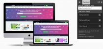
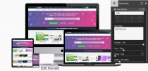
DeviceIt - Check how your website looks in devicesDeviceIt - Check how your website looks in devices
It helps you generate looks of the website on different devices using URLsDeviceIt - Check how your website looks in devices
It helps you generate looks of the website on different devices using URLs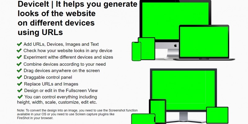
Overview
DeviceIt | It helps you generate looks of the website on different devices using URLs.
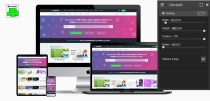
Generate a mockup of the website on different devices using URLs.
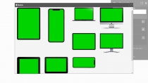
You have full control on your hand, you can combine the devices according to your need, Customize, add, delete, and do many things with this app.
Features
- Add URLs, Devices, Images and Text
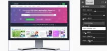
- Check how your website looks on any device
- Experiment with different devices and sizes
- Combine devices according to your need
- Drag devices anywhere on the screen
- Draggable control panel
- Replace URLs and Images
- Design or edit in the Fullscreen View
- You can control everything including height, width, scale, customize, edit etc.
Requirements
Note: To convert the design into an image, you need to use the Screenshot function
available in your OS or you need to use Screen capture plugins like
FireShot in your browser.
Future product updates
Quality checked by Codester
Lowest price guarantee
| Category | Scripts & Code / JavaScript / Miscellaneous |
| First release | 21 April 2021 |
| Last update | 21 April 2021 |
| Files included | .css, .html, Javascript .js |
| Tags | screenshots, mockup generator, responsive website checker, multi-device viewport, url to mockup |


