RFI-helper - Responsive Floating ImagesRFI-helper - Responsive Floating Images
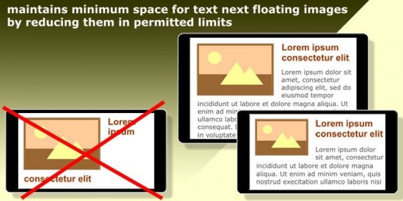
Maintains minimum space for text next floating images by reducing them in permitted limitsRFI-helper - Responsive Floating Images
Maintains minimum space for text next floating images by reducing them in permitted limits
Overview
RFI-helper v2.0 - Responsive Floating Images
RFI-helper is a jQuery-plugin. It maintains minimum space for text next floating images by reducing them in permitted limits. If further reduction is impossible, the plugin cancels floating, returns image its original size and sets it in the center of column.
The plugin doesn't have any methods. The script is run after loading the document. Window events "resize" and "orientationchange" start recalculation.
Platform: jQuery1.7.0+
Features
- Applicable for images that are inside an element-wrapper as link, floating div etc.
- Provides table format of text next floating images: text is formatted in separate column like a table-cell (see live, right column).
- Sets responsive style for floating images.
- Sets different custom styles to floating and unfloating images, and different styles to left and right images too.
- Compatible with Wordpress.
Usage
$( "#content img" ).rfiHelper();
If the image is inside an element-wrapper as a link or a floating div etc:
$( "#content a:has(img)" ).rfiHelper();
Options:
- cssFloat : "left" or "right".
- fixedFfloat : bans cancellation of floating even if the space for text has become too narrow.
- space * : minimum space for text. Default value: 200
- indent * : the distance between the image and text.
- margin : the distance between the image and margin of column.
- minSize * : minimum allowable image width.
- maxSize * : maximum allowable image width.
- ratio : the proportion in which allowed to reduce the image. Default value: 0.5
- tableFormat : text is formatted like a table-cell. This property works correctly, if each image with following text have own container.
- tableFormatRatio : limits height of text column. If text column has become too high (more than twice image height by default), the property "tableFormat" is canceled.
- floatClass : adds a custom class if the image is floating and removes it when the image looses floating.
- noFloatClass : adds a custom class unfloating images and removes it when the image gets floating.
- leftFloatClass and rightFloatClass : add different custom classes left and right images accordingly and remove them when images loose floating.
*) for this property you can use complex notification: "100, 480: 200, 640: 50%". It means: 100px by default, 200px if parent width 480px and more, 50% if parent width 640px and more. Number of components is not limited.
Settings:
$( "#content img" ).rfiHelper({
  "space": 300,
  "indent": "10, 480: 15, 640: 20"
});
In all cases the plugin sets css-properties "min-width: 0" and "max-width: 100%". If you want to set another width limits, you can use instead "min-width" and "max-width" the settings "minSize" and "maxSize".
| Category | Scripts & Code / JavaScript / Miscellaneous |
| First release | 11 August 2015 |
| Last update | 11 August 2015 |


